The colours of seven masterpieces, measured
Hex codes, shares and the wall colour each one suits. Measured from the print files, not picked by eye.
What we found
- Hilma af Klint is about four times as saturated as Hiroshige. The average chroma of the af Klint palettes is 29–41; Hiroshige’s three prints sit at 7–11. Hiroshige works as a calm, almost neutral picture with small sparks of colour; af Klint sets the colour of the whole room.
- One painting is mostly one colour. In The Ten Largest, No. 4 a single orange covers 55 percent of the surface. In the other six, the largest colour covers 26–44 percent.
- The strong colours are smaller than they look. The maple leaves in Maples at Mama are 3 percent of the print; Kandinsky’s cobalt is 9 percent. Small areas of a saturated colour carry a picture.
- None of the seven contains much black. Near-black (lightness under 15) is at most 3 percent in every work. A black frame is therefore a contrast, not an echo: fine for the Hiroshige prints and the Kandinsky, softer choices suit the af Klint paintings.
| Work | Largest colour | Mean chroma | Near-black |
|---|---|---|---|
| The Ten Largest, No. 3, Youth | burnt orange 28% | 32 | 2% |
| The Ten Largest, No. 4, Youth | burnt orange 55% | 41 | 0% |
| The Ten Largest, No. 7, Adulthood | lilac grey 38% | 29 | 0% |
| Fireworks at Ryogoku Bridge | night grey 44% | 7 | 0% |
| Maples at Mama | paper cream 26% | 11 | 0% |
| Sudden Shower over Shin-Ohashi Bridge and Atake | rain grey-green 41% | 7 | 3% |
| Improvisation No. 30 (Cannons) | canvas cream 37% | 18 | 2% |
How to use a palette at home
Three moves, in this order. Echo: take the wall or a large surface from one of the big colours, softened. Accent: put one of the small, strong colours in one object, a cushion or a vase. Contrast in lightness: a light wall behind a dark picture or the reverse, but keep the same temperature as the picture. Avoid saturated colours near the print that do not appear in it. The suggestions below follow these rules; more in how to match art to your room colours and which wall colour makes art pop.
Hilma af Klint, The Ten Largest, No. 3, Youth, 1907
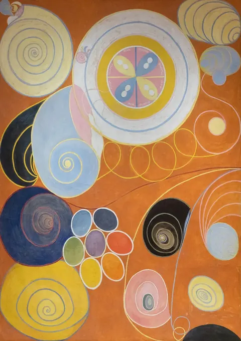
| Colour | Hex | Share |
|---|---|---|
| burnt orange | #cb7232 | 28% |
| lilac grey | #b0afb4 | 24% |
| sand | #baa27c | 18% |
| slate | #3e3f4a | 12% |
| mustard | #d0a939 | 11% |
| rust | #985226 | 8% |
Accents (small but distinct): #d8a928 #c5ba8b #2b3a5e
Orange leads, but only just: it covers 28 percent, and a cool lilac grey follows close behind at 24. That second colour is why No. 3 feels calmer than its sister, No. 4 (mean chroma 32 against 41). The dark slate spirals (12 percent) give it weight.
- Wall: a warm sand or stone wall (an echo of the sand at 18 percent), or a deep slate wall if you want the orange to glow.
- One object: one navy or mustard object in the room, both measured in the painting.
- Frame: natural wood for warmth, black to pick up the slate.
Hilma af Klint, The Ten Largest, No. 4, Youth, 1907
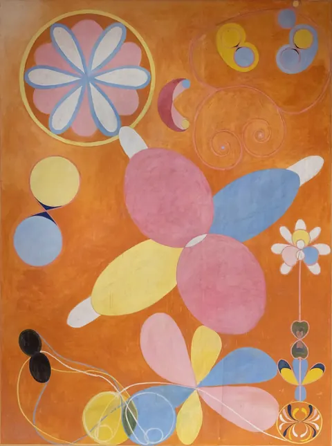
| Colour | Hex | Share |
|---|---|---|
| burnt orange | #bf6d2f | 55% |
| dusty pink | #c38384 | 15% |
| cornflower blue | #8498b6 | 10% |
| straw yellow | #d7bb6a | 10% |
| blush | #ccb4b0 | 9% |
| umber | #4d4443 | 2% |
Accents (small but distinct): #d08128 #dfc976 #ca7f8b
The most single-minded painting of the seven: one orange covers 55 percent of the surface. Everything else is soft pastel on top. A painting like this decides the room’s main colour for you.
- Wall: a soft blue-grey, related to the cornflower blue (10 percent) and opposite the orange on the colour wheel, or a warm white.
- One object: dusty pink in a cushion or throw, measured at 15 percent.
- Frame: white or natural wood; the painting has almost no dark tones (under 1 percent) for a black frame to echo.
Hilma af Klint, The Ten Largest, No. 7, Adulthood, 1907
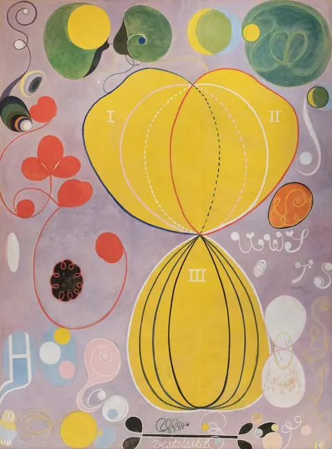
| Colour | Hex | Share |
|---|---|---|
| lilac grey | #b09aa1 | 38% |
| gold | #deb83b | 31% |
| pale mauve | #cbbcb4 | 14% |
| sage | #73845e | 9% |
| vermilion | #ce5e43 | 4% |
| charcoal | #47453f | 4% |
Accents (small but distinct): #e4bf31 #d65241 #36456f
Two colours carry 69 percent: a quiet lilac grey (38) and a strong gold (31). The ground is almost neutral, so the gold reads as light. Sage green (9 percent) and a small vermilion are the accents.
- Wall: pale grey or pale lilac, an echo of the ground, so the gold shapes float.
- One object: sage green in plants or linen, measured at 9 percent.
- Frame: white or natural wood; black only if you want strong contrast.
Utagawa Hiroshige, Fireworks at Ryogoku Bridge, 1858
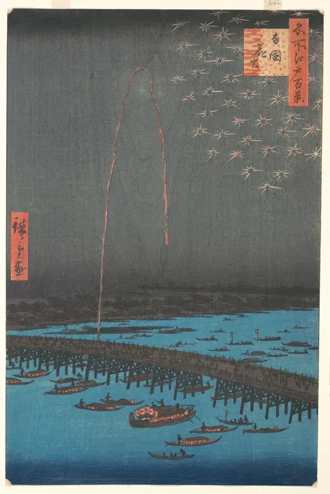
| Colour | Hex | Share |
|---|---|---|
| night grey | #696b67 | 44% |
| charcoal | #4b4b49 | 23% |
| river blue | #4e8293 | 16% |
| paper | #faf3e2 | 8% |
| indigo | #2d4b64 | 5% |
| persimmon | #c57f64 | 3% |
Accents (small but distinct): #cf6f55 #ddab80
Two near-neutral greys cover 67 percent: this is a night picture. The colour lives in the river (blue, 16 percent) and in tiny touches of persimmon in the cartouches. Its average saturation is about a sixth of Hilma af Klint’s No. 4.
- Wall: a pale warm white or cream, an echo of the paper (8 percent), so the dark print reads as a window at night.
- One object: one persimmon or terracotta object, the strongest colour in the print.
- Frame: black or natural wood.
Utagawa Hiroshige, Maples at Mama, ca. 1857
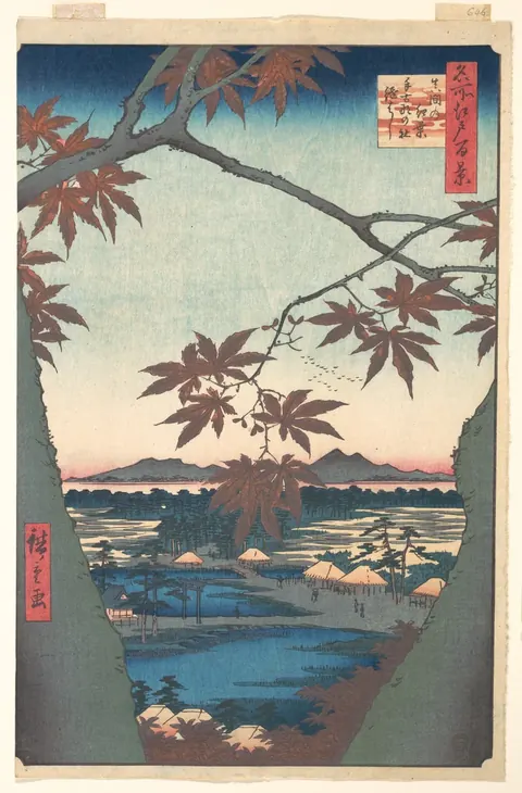
| Colour | Hex | Share |
|---|---|---|
| paper cream | #f2e0c6 | 26% |
| stone grey | #737872 | 20% |
| pale sage | #c6cab6 | 20% |
| mauve brown | #6f5d57 | 16% |
| deep teal | #415c6a | 15% |
| maple red | #bf7064 | 3% |
Accents (small but distinct): #d1615c #4e8196
The lightest of the seven: 23 percent of the surface is near white (the sky and the paper margin). Pale sage and grey make up most of the rest; the maple leaves are only 3 percent, which is why they look so red.
- Wall: pale sage or soft green-grey, an echo of the 20 percent sage.
- One object: maple red in one small object; deep teal for a second.
- Frame: natural wood, or black for a graphic look.
Utagawa Hiroshige, Sudden Shower over Shin-Ohashi Bridge and Atake, 1857
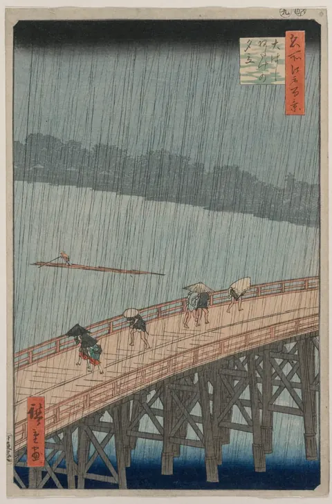
| Colour | Hex | Share |
|---|---|---|
| rain grey-green | #899089 | 41% |
| wet olive | #5d5f59 | 24% |
| bridge tan | #b6a38e | 16% |
| ink | #212b33 | 8% |
| mist | #d7cfc5 | 6% |
| cedar | #9d6e59 | 6% |
Accents (small but distinct): #b86348 #10314d
One of the calmest palettes here: grey-green and olive cover 65 percent, the bridge adds warm tan (16 percent). It has the most near-black of the seven, but even that is only 3 percent.
- Wall: warm stone or tan, an echo of the bridge, so the rain stays cool against it.
- One object: deep ink blue, the darkest colour in the print.
- Frame: black to echo the ink, or natural wood.
Vasily Kandinsky, Improvisation No. 30 (Cannons), 1913
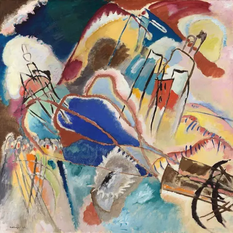
| Colour | Hex | Share |
|---|---|---|
| canvas cream | #cdbca9 | 37% |
| grey teal | #809a9e | 18% |
| umber | #453e3a | 13% |
| brick red | #9e584a | 13% |
| ochre | #dab972 | 10% |
| cobalt | #253f73 | 9% |
Accents (small but distinct): #e3ac45 #a84535 #224672
It looks wild, but 37 percent is a calm cream ground, and the bright colours are smaller than they seem: cobalt is 9 percent, ochre 10. That cream is what lets it hang in an ordinary room.
- Wall: cream or warm white, an echo of the ground.
- One object: cobalt blue or ochre, one of them, not both.
- Frame: black, which picks up the umber lines, or white.
How we measured
Each palette comes from the same file we print from: public-domain scans from Wikimedia Commons, the Metropolitan Museum of Art, the Cleveland Museum of Art and the Art Institute of Chicago. The image is reduced to 360 pixels on its long side and its pixels are grouped into six colours with k-means clustering in CIELAB, a colour space built to match how people see differences. The share is the part of the picture area each colour covers; the hex is the average colour of that group. Accents are smaller groups whose hue lies at least 40 degrees from the picture’s main hue. Mean chroma is the share-weighted saturation of the six colours.
Limits: a scan is not the painting. Lighting, the scanner and the age of the paper all shift colour, and the Hiroshige files include part of the paper margin of the original sheet. Your screen adds its own shift. Treat the hex codes as a good starting point for paint and fabric, and check samples in your own light.
Use the data
The full measurements are free to use under CC BY 4.0 with a link to this page: palettes.csv · palettes.json.
Questions
What colours are in Hilma af Klint’s The Ten Largest?
Measured from the prints: No. 3 and No. 4 (Youth) are led by burnt orange (#cb7232 covers 28 percent of No. 3, #bf6d2f covers 55 percent of No. 4) with pink, cornflower blue, straw yellow and lilac grey. No. 7 (Adulthood) is led by a lilac grey (#b09aa1, 38 percent) and gold (#deb83b, 31 percent).
What wall colour goes with Hiroshige prints?
Hiroshige’s prints are low in saturation and mostly grey, blue and paper cream, so a pale warm white, cream, pale sage or warm stone wall suits them. Keep strong colour to one small object in the print’s own red or persimmon.
How were these colours measured?
By grouping the pixels of each print file into six colours with k-means clustering in the CIELAB colour space and reporting the average colour and area share of each group. The method and its limits are described above.